Less is More
I’m heading for less. The details aren’t fully worked out yet, but I’ve been toying with my own WordPress Theme. Not really rolling one myself from the ground up, but there are just a few tweaks I’d like, and the endless debate — scary interior monologue — about what system works best?
I’m pretty sure the end user doesn’t care, and agreed.
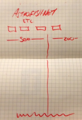
The main column should be 500 px wide, with, thinking on paper, plus a margin. The trick, I finally wrestled with, was to use a 2-column setup, but not to populate that primary sidebar with too much.
While I’ve been a stickler, and adopted a very precise Golden Ratio for the body copy (font, typeface), I’m also sticking to the older standard of San Serif headlines with Serifed body copy: think traditional newspaper design.
Newspapers used that combination for maximum readability.
I wonder what would happen if I flipped that around? Still like the 500 px column width.
The original sketch?

That original “less is more” sketch is undated in the notebook, but the location suggests the last month or two.
Sneak Peak:
First Second Beta test.
I prefer San Serif headlines with Serifed body copy. Just color me “traditional”.
Yeah, still playing with that. tried it at the Apple store the other day. One of those over-sized monitors…