The lamentable and sad typeface, Comic Sans.
Examples rants? Here and here.
Truthfully? Valid points. Typography — a sense of style — plays into perceptions. It’s all about non-verbal communication — with words. How we say what we say. So to speak.
Comic Sans? Confessions from my side of the keyboard? For years. Years and years, I’ve used “Comic Sans” as the default font on my word processor that I use to write the horoscopes. In my writer’s mind, the display is less formal, and it’s easier for me to wrangle the words to the screen, and in some kind of formal order. Casual and yet, it is printed. Looks sort of like it might’ve been hand-lettered, but no, in reality, straight from the QWERTY keyboard.
Comic Sans use in formal communication is lamentable. Perhaps close to a dozen years back, maybe further than that, I had a portable banner made, just my URL, “ASTROFISH.NET,” white caps against a red background. Banner’s image is oft repeated, and shows up on various pieces of signage I employ.
Getting ready to roll out my own WordPress theme, I’ve tried to pay close attention to simplified typography. More precise with cleaner, crisper display. I already know that the “retina” devices render certain, proper type faces (fonts) in an enahnced form. I’m working to roll that in. I’ve already had to double up on images as the retina display, iPhone, iPad, i-thing, that shows up with the conventional images looking grainy and degraded graphics. Quick and easy manipulation, just double the base image’s size, for example, all of the sign thumbnails are available in a retina display version alongside the conventional one. Crisp.
Crisp leads to St. Crispin’s Day.
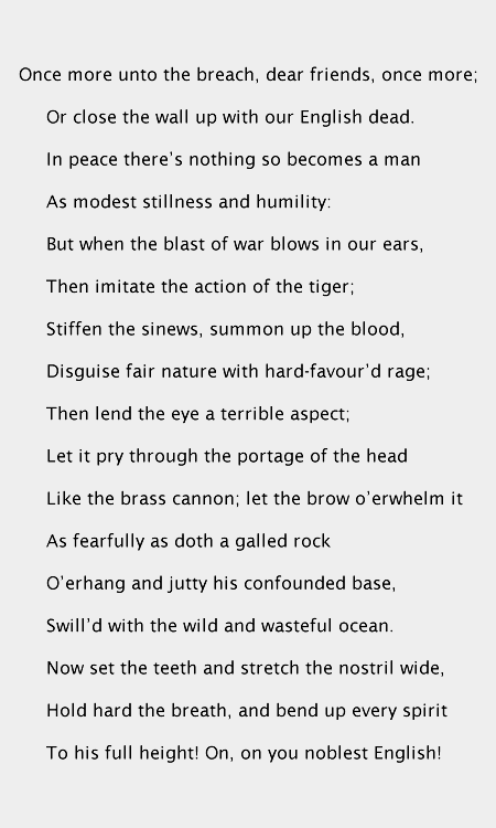
Comic Sans face-to-face with Lucinda (Lucinda Sans):
The images don’t really render quite as well as I had hoped, with the text — obviously — Henry V’s famous assault?
I was looking for a body of text that was similar to lorem ipsum, but more familiar to me.
Comic Sans — its roots with me go back to college days and early graphic software that included a comic-book lettering typeface as part of the package. I got to where I liked that one font because it was remarkably casual in look and feel.
At that time, there was also one text I had the most trouble reading. Think it was Russian Lit, might’ve been English Romance-era, I don’t recall. The real root of the problem, in retrospect, was the font, the typeface used in that text. I didn’t like it, and the face didn’t read well.
So it matters what font is used. Comic Sans? That’s a private affair. I’ll use it in the privacy of my own home, but not for public consumption. Not even in the tabloids.

