Dancing Around Wireframes
Pause I as I make a mental trip back to yesteryear. Get to a certain point, and “thinking back” can have deleterious side effects, like getting caught in a reverie, then losing one’s place in the current stream of time.
What started this was a current obsession to dig through the archives and discover the greatest bits, and to insure I’m not reusing old metaphors. Nothing’s worse than a recycled horoscope.
No repeats on Thursday.
It’s a noble goal.
“Veracity is not insured, see dealer for details.”
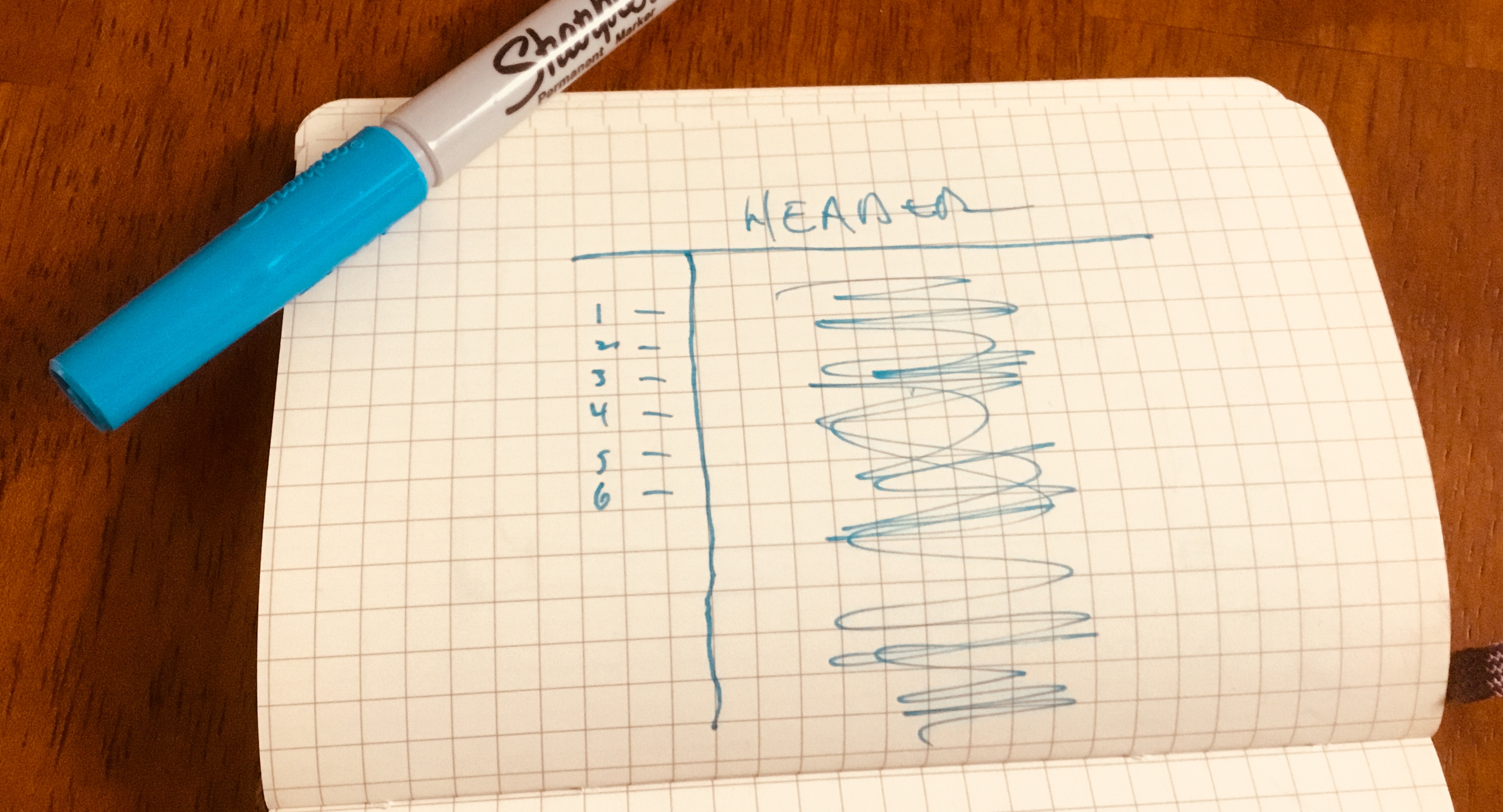
What prompted this idyl? Old image cycled up, prompted by Mercury and its location compared with where it might be in my chart, and I recall one of the more influential sites I looked at, not for content, although the technical material was of interest to me, but what I liked was the simplicity of a such a spartan layout.
To wireframe it, simple enough, it was actually a two column design but the first column was more a navigation in six links or less, with no header, and then, no footer, and the content itself in a fluid container, essential one web page wide.
Left-hand navigation menu that was, I’m thinking the first time was merely links, but the second time, possibly buttons, again, not large. Super-simple, and straightforward, as web pages were growing more complex, the simplicity was like a beacon of sanity in a morass of poor choices.
Dancing Around Wireframes
“Poor choices make the best stories,”
but that’s not what this was about.
I yearn for that simplicity. For a while, the site “Medium” achieved this kind of goal, but as devices and the nature of the web split and was rent asunder? Then, apparently, a media company with no coherent direction and a no way to monetize its structure, that leads to an amorphous mass of uncertainty.
Basic business.
Dancing Around Wireframes
The essential difference between the front page of my site and the blog page of astrofish.blog? Here in the blog, which is defined as “experiential and experimental,” the header, the name and tag line sit below a stripe that has a few menu elements. Some stuff is carried in the sidebar, on the left. The astrofish.net site itself, the header and tag line sit above the minimal navigation menu items with spurious data on the right.
That’s how it was when I started writing about this.
Dancing Around Wireframes
Links that are required?
- about astrofish.net
- astrofish.net/shop
- astrofish.net/contact
- astrofish.net/travel
- astrofish.net/books
- search function
Due to the litigious nature of the modern world, there has to be link to some kind of Terms of Service/Privacy Policy/The Fineprint, but, in theory that onerous weight is covered by the first page of the site, above the fold. I don’t recall.
I pride myself on being second only to Apple in the greatest number of people who haven’t read all the terms of service.
Dancing Around Wireframes
Girl — woman — looks over at me, and asks, “Is it ever going to get any better?” Been a tough a week or two, so far, tougher if you’re stupid about it, and the answer? Yeah, no. Won’t get “better” until September 1.
Mars is currently retrograde in Aquarius, conjunct eclipse points, which adds to the frustration, all being in fixed signs, and then, Mercury is retrograde in Leo, again, the sign opposite from that Mars position, and figures into the eclipse patterns, as well. Dancing Around Wireframes is a good exercise — for me — at stripping away unnecessary digital ephemera that brings no value to my life. Not like any of this is totally toasted, I can easily go back to what I had before, just, at times like this? Maybe getting rid of stuff, or moving items — like design elements — to the unused portion of the whiteboard? Maybe that is the best use of time.
I’ve been so carefully positioned between analog and digital, wrestling ideas from my mind to the digital blackboard, always been a bit of a challenge. Not ink that I’m used to and one would think, by now, I would be used to it.
This weblog is experimental and experiential — used to say so in the title tag. I still think of it that way, and in the next few days, think I’ll work on more minimalist presentation.
Dancing Around Wireframes
Recommendations, links, how, and why.
