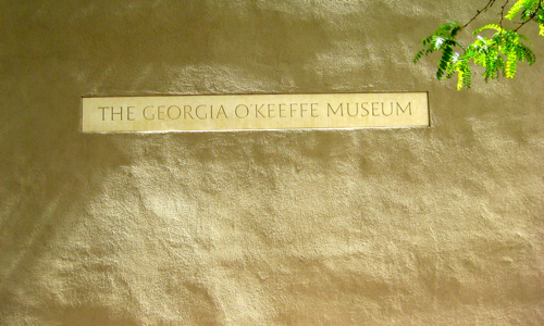
I love it when natural colors reflect the theme’s intended imagery. I also love Georgia O’Keefe’s body of work.

Sepia Scenes
One afternoon in Santa Fe. Morning, really.
No retouching. Makes it even more cool, to me.
I love it when natural colors reflect the theme’s intended imagery. I also love Georgia O’Keefe’s body of work.

No retouching. Makes it even more cool, to me.
Use of this site (you are here) is covered by all the terms as defined in the fineprint, reply via e-mail.
© 1993 – 2026 Kramer Wetzel, for astrofish.net &c. astrofish.net: breaking horoscopes since 1993.
It’s simple, and free: subscribe here.
Next post: Green Door
Previous post: Security Sign
Would love to visit this museum, Kramer! :)
Beautiful job!
The sepia tinged sign looks perfect on the sepia adobe. The sign placement was determined by an artist no doubt…
Beautiful because it’s the natural thing.
Sepia Scene
I like the sign, but when I think of Georgia O’Keefe, I think of swirls of color, and deep contrasts, not straight lines and subdued tones.